
Table of Contents
The 7 ideas, in one line each
- Minimal that breathes.
- Travel-guide style.
- Editorial with big photos.
- Everything on a single page.
- Romantic with soft colour.
- Practical, built around RSVP.
- Hybrid: emotion up front, organisation behind.
Why some wedding websites look beautiful and still don’t work
Here’s what usually happens: you search for wedding website inspiration and end up seeing gorgeous things that wouldn’t work for your wedding at all. Lots of visuals, little utility. Lots of effects, not much clarity.
A beautiful wedding website isn’t one that looks like a fashion editorial. It’s one that manages three things at once:
- conveys your style,
- helps guests find their bearings,
- and doesn’t force you to explain the same thing twenty times.
When that happens, you can tell.
If you’re still sorting out the practical side, it’s worth checking the essential wedding website checklist or the guide on how to create a free wedding website step by step before continuing. Here we’re after something else: inspiration with purpose.
7 wedding website ideas that actually make sense
1. The minimal wedding website that breathes
Best for: urban, intimate or very clean-aesthetic weddings.
Light background, elegant type, one strong photo and very few visual decisions. Works especially well for urban, intimate or pared-back weddings.
The best thing about this style is that it lets the information breathe. The downside is that if you try to make it “too premium”, you can end up hiding important buttons like the map or RSVP. Classic mistake.
2. The travel-guide style website
Best for: weddings with travelling guests or a full weekend away.
This one I love for weddings with guests coming from out of town. The homepage is still emotional, yes, but the heart of the site is the logistics: hotels, transfers, what to do over the weekend, schedules and the map.
Picture it: a country estate wedding, people arriving from different cities, brunch the next morning. If you don’t centralise that well, the WhatsApp group turns into a helpdesk.
3. The editorial site with big photos
Best for: couples with great photography and a strong visual story.
Full-bleed photos, wide sections, headlines with more personality and a slightly more developed couple narrative. Works beautifully when you have good images and want the site to move people as well as inform them.
The trick here is not to overdo it. I’ve seen gorgeous sites where the couple’s story takes up more space than the ceremony schedule. You notice immediately.
4. The short site with everything on one page
Best for: simple weddings, easy-to-share links and zero fuss.
The best option if you want something easy to share and even easier to understand. One page, well ordered, with quick navigation and clear buttons.
A great fit if the wedding is straightforward and doesn’t need too many layers. If you’re also pairing it with a digital invitation, even better. To assess that combination, here’s a comparison between wedding website and digital invitation.
5. The romantic site with soft colour
Best for: weddings with a distinctive stationery style and a very defined visual direction.
Earth tones, sage green, ivory, dusty pink. Delicate illustrations, rounded buttons, a calm feel. Works really well if your stationery or invitation already goes in that direction.
No need to overcomplicate it: sometimes a coherent palette, a good cover photo and two well-placed visual details are all you need. Everything else is noise.
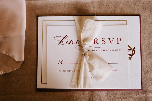
6. The practical site built for RSVP
Best for: weddings where the priority is confirming attendance without chasing anyone.
Here the visual priority isn’t aesthetics: it’s action. Confirm button at the top, short text, very clear schedule and well-placed FAQs.
It won’t be the most spectacular site in the world, but when the real problem is getting responses, this one wins.
7. The hybrid site: emotion up front, organisation behind
Best for: most real weddings, especially if you want one balanced solution.
This is probably the best formula for the majority of couples. The cover has a personal, attractive feel, and everything is built so guests can find what they need in two clicks.
It’s the most balanced option. And, honestly, usually the smartest one.
How to choose the idea that fits your wedding
If you’re stuck, try this quick filter:
- Intimate urban wedding: minimal or editorial.
- Wedding with out-of-town guests: travel-guide or hybrid.
- Simple, very practical wedding: single page or RSVP focus.
- Wedding with a very strong visual identity: romantic with colour.
Don’t try to look like another couple. That’s usually the fast lane to a beautiful but completely wrong-for-you site.
What to copy and what not to copy from examples
I would copy:
- a clear structure,
- a coherent visual direction,
- a simple way to present schedules and maps.
I wouldn’t copy:
- endless galleries,
- overly long intros,
- visual effects that slow loading on mobile,
- generic text that could belong to any wedding.
A useful closing thought before you start designing
Good inspiration isn’t what makes you save twenty screenshots. It’s what helps you say: “right, we know what kind of site we need.”
If you’ve got the style clear, the next step isn’t to keep looking at ideas: it’s to open the tool and try a real version.